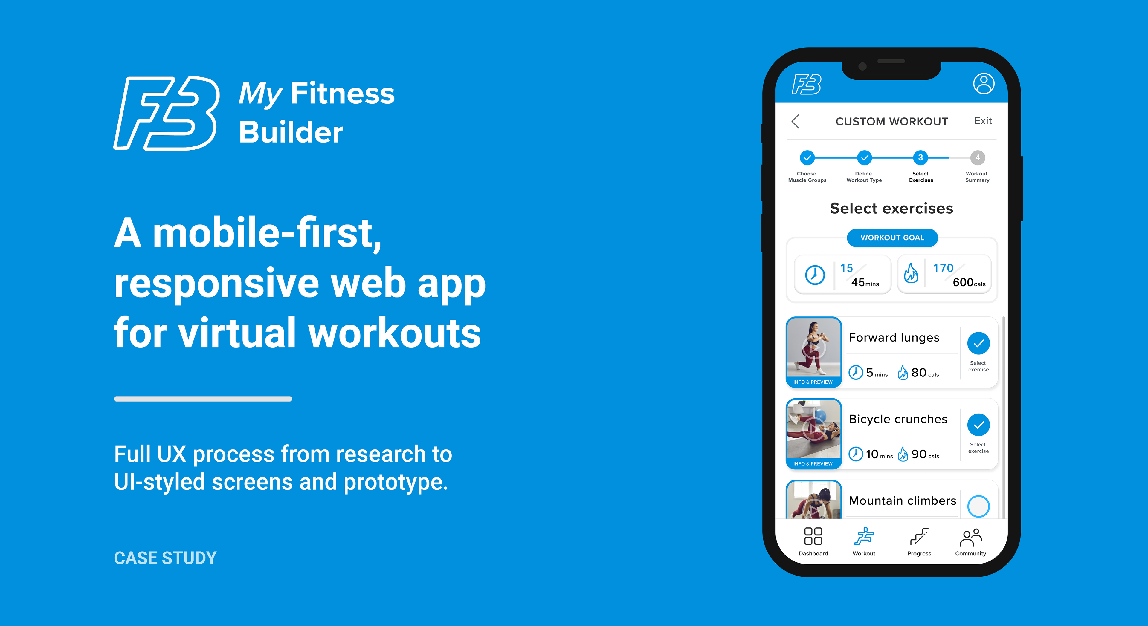

Objective
Design a user-centred responsive web app for people who need to improve their physical well-being for health reasons, to keep fit and to feel good. Attention is to be given to those with injuries in certain muscle groups.
Challenges
– Offer a varying degree of workout customisations to achieve user fitness goals.
– Allow a function for users with injuries who need to include/exclude certain muscle groups from exercises.
– Enable socially active users to work out with friends virtually to improve their motivation and well-being
Tools
Adobe XD | Figma | Adobe Creative Suite | Usability Hub


Competitor Research
I carried out research on existing fitness apps and websites to assess their USPs, positives and pain points for users. This was via the hands-on use of products and looking at reviews to gauge how well they had been received.
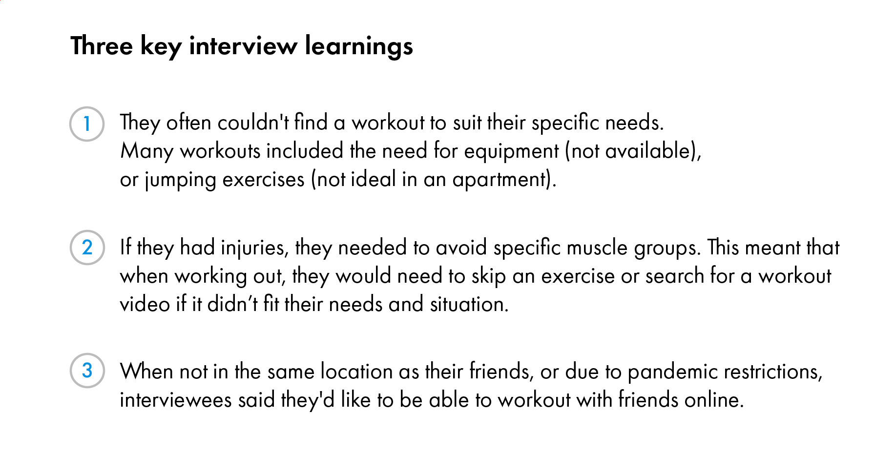
Interviews
Video and face-to-face interviews were carried out with 6 health-conscious participants who had recently used or were currently using fitness apps or websites. I learned about the interviewees' habits, needs and pain points when trying to lose weight or get fit with current products.
I carried out research on existing fitness apps and websites to assess their USPs, positives and pain points for users. This was via the hands-on use of products and looking at reviews to gauge how well they had been received.
Interviews
Video and face-to-face interviews were carried out with 6 health-conscious participants who had recently used or were currently using fitness apps or websites. I learned about the interviewees' habits, needs and pain points when trying to lose weight or get fit with current products.


User Personas
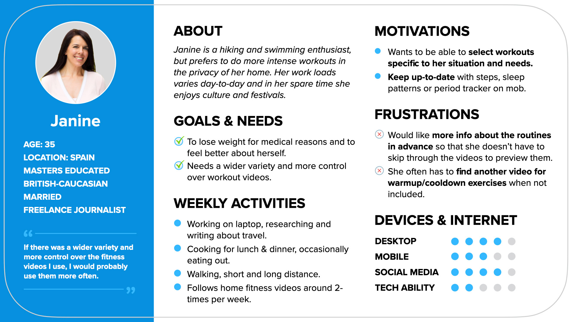
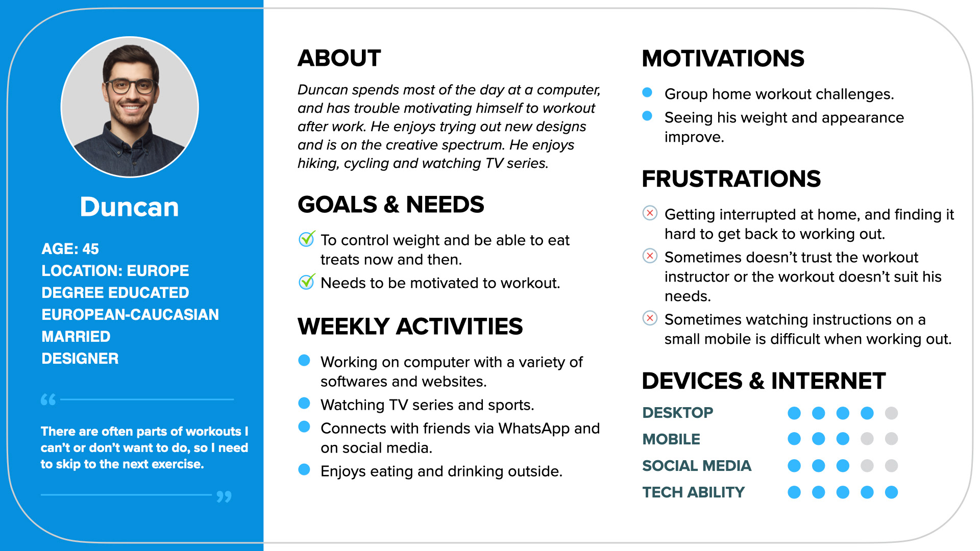
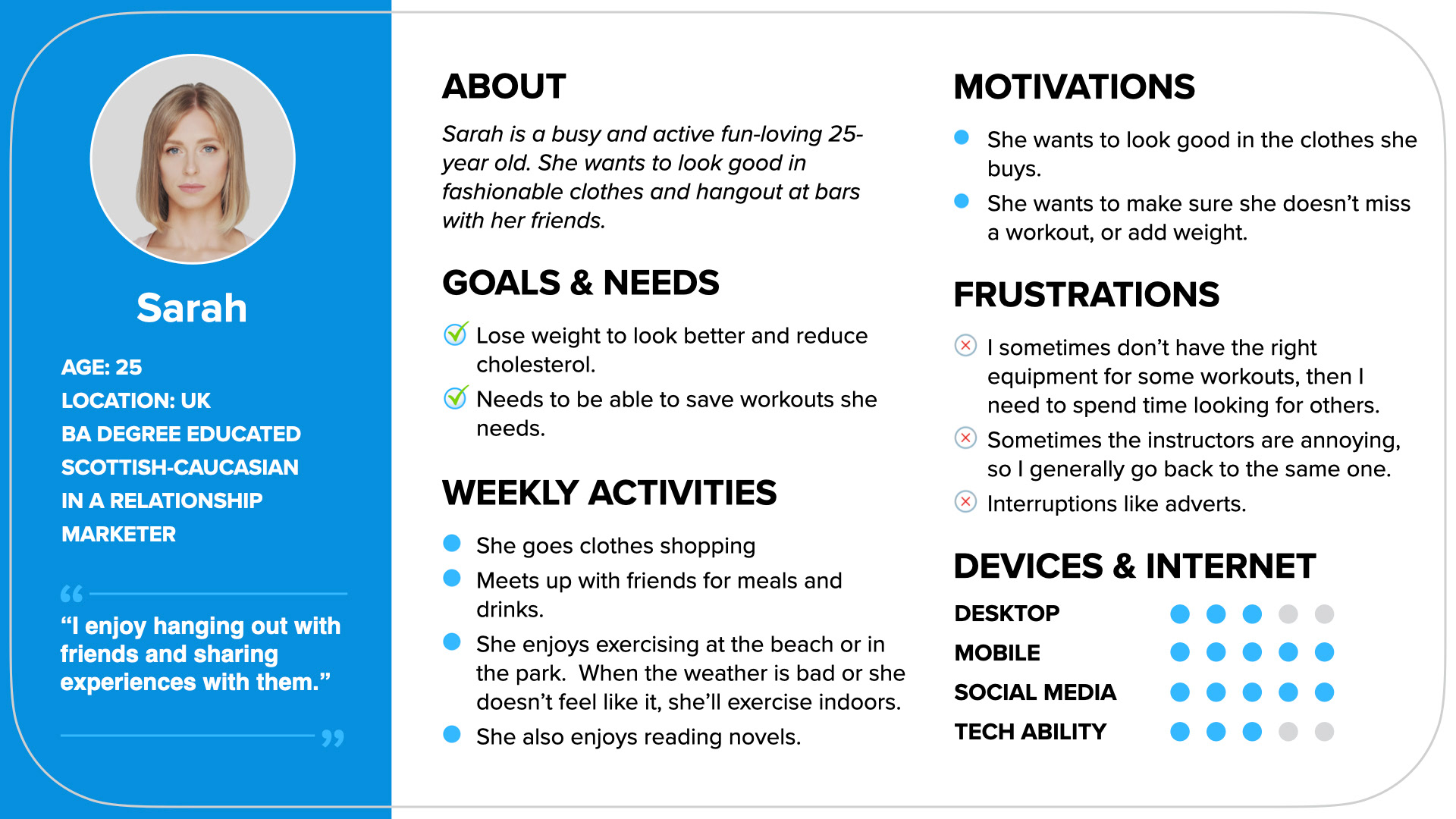
Meet Janine, Duncan and Sarah. Using the research and key takeaways from the interviews, I developed these three user personas.
These user personas would inform my decisions going forward. For instance, I would ask myself:
"Would Janine be happy with this flow? Does it fit her needs? Would it be easy enough to use and navigate as her tech ability is not that great?"
These user personas would inform my decisions going forward. For instance, I would ask myself:
"Would Janine be happy with this flow? Does it fit her needs? Would it be easy enough to use and navigate as her tech ability is not that great?"
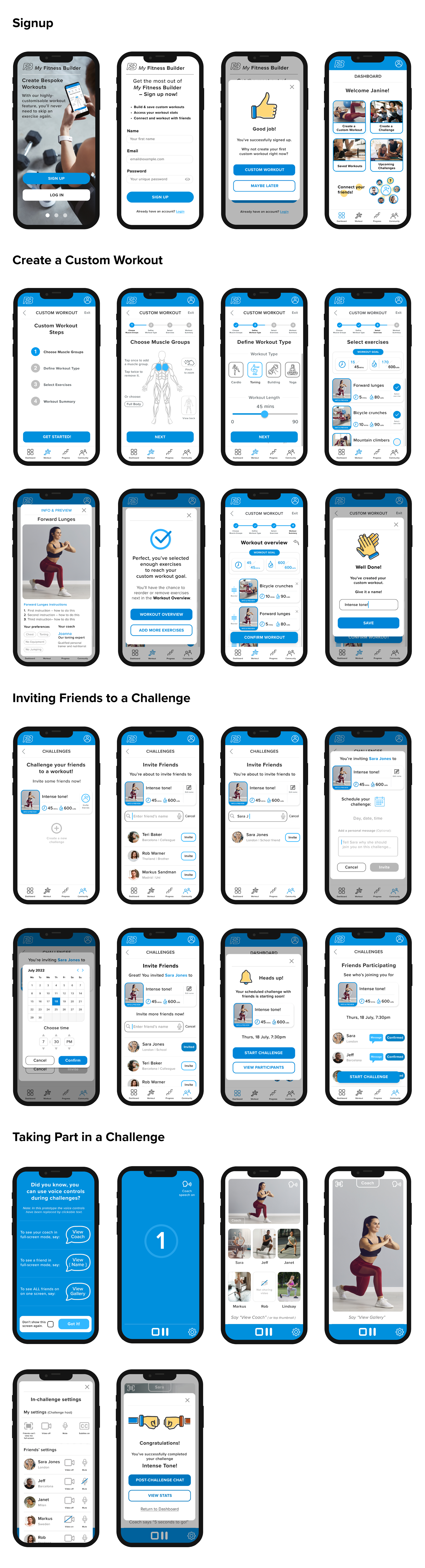
User Flows
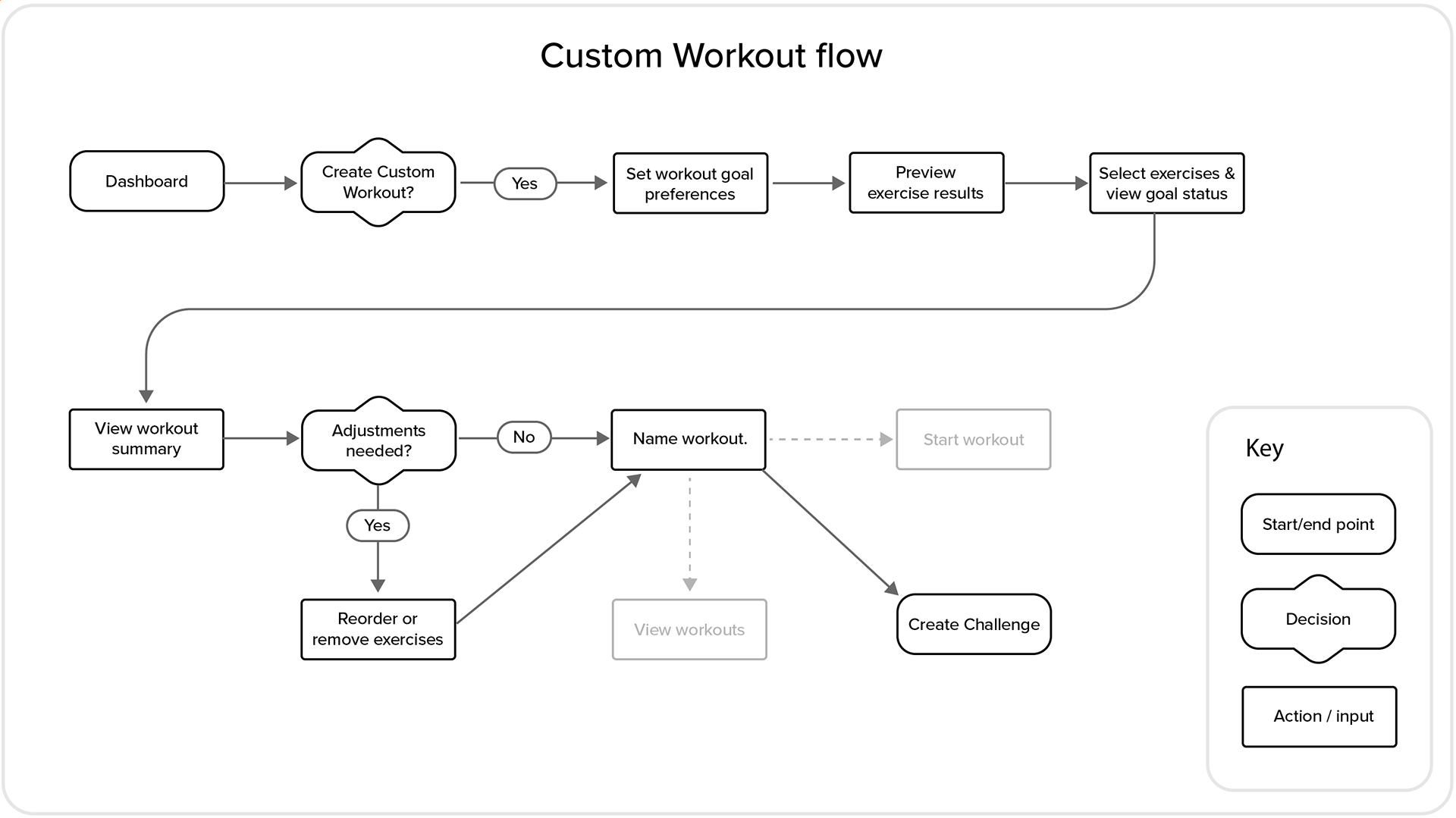
Using the user personas as an influence, I developed user flows.
The main feature of the user flows, aimed at pleasing Janine and Duncan, is the custom workout flow.
This provides the option to define preferences, select specific exercises and then reorder exercises to create a bespoke workout.
The main feature of the user flows, aimed at pleasing Janine and Duncan, is the custom workout flow.
This provides the option to define preferences, select specific exercises and then reorder exercises to create a bespoke workout.
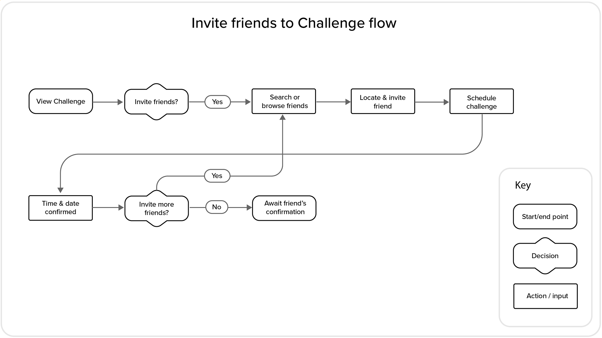
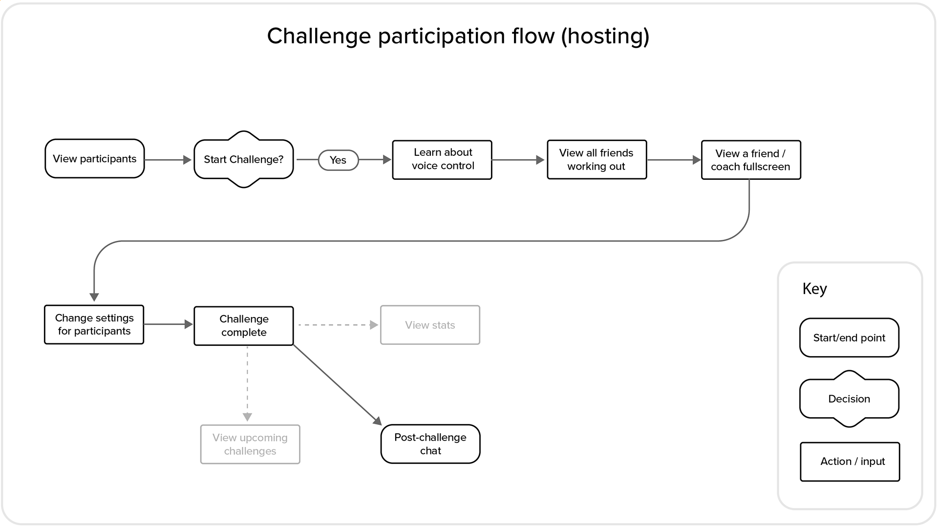
In order to motivate social Sarah, I created flows for inviting her friends and to workout with them via the 'Challenge participation'.
The main structure of the original user flows stood the test of time, however, there were a few alterations to the 'Challenge participation' flow after user testing sessions indicated changes were needed. Therefore voice control instructions and the ability to view all friends at the beginning of the challenge were added to the flows.
The main structure of the original user flows stood the test of time, however, there were a few alterations to the 'Challenge participation' flow after user testing sessions indicated changes were needed. Therefore voice control instructions and the ability to view all friends at the beginning of the challenge were added to the flows.
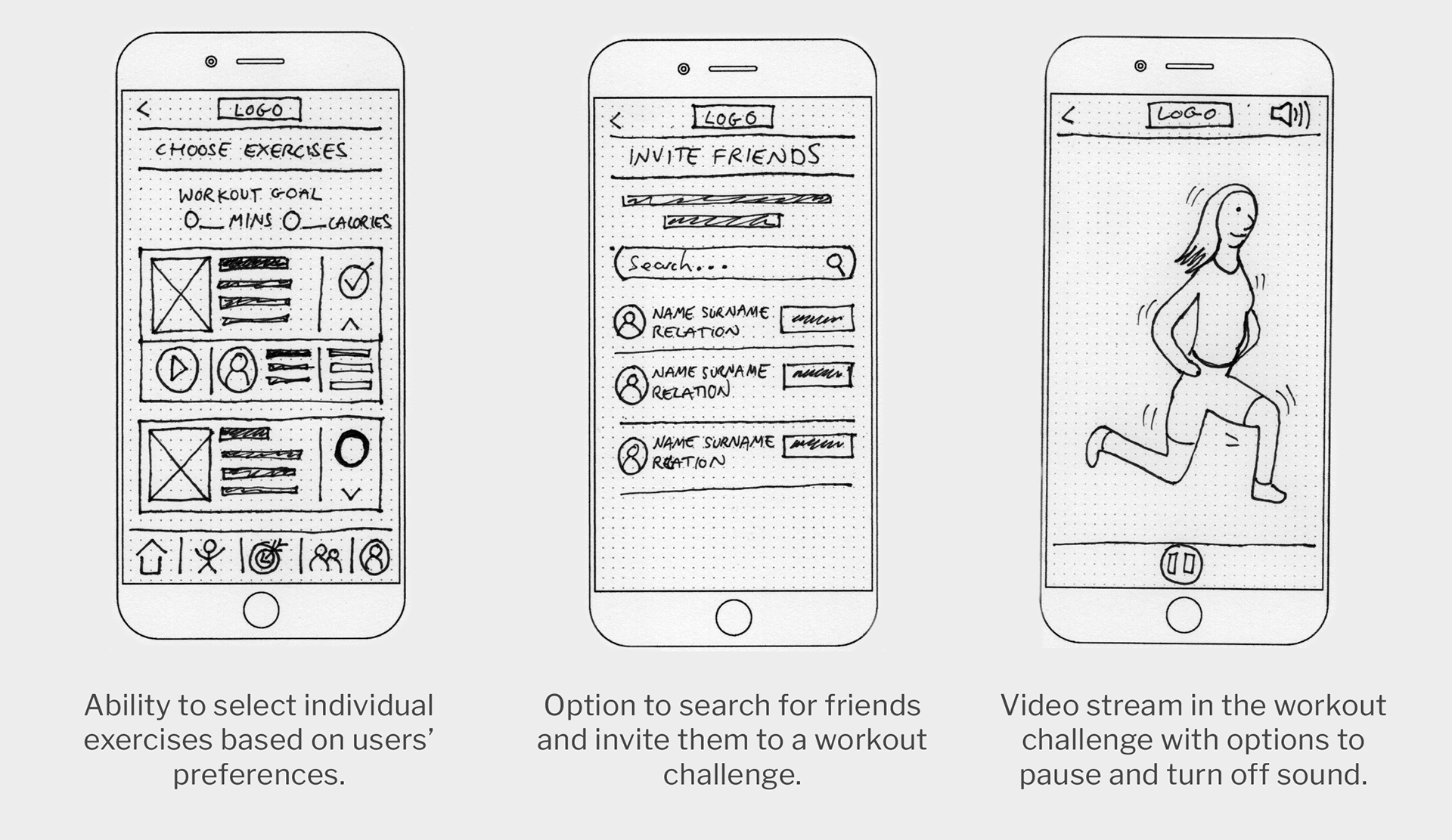
Ideating Solutions
Using the user personas and flows as guidance, I rapid-prototyped ideas of functions, elements and layout on a screen-by-screen basis. At this early stage, it's important to get ideas down quickly in low-fidelity, which can be scrapped and changed easily based on feedback and design decisions.
Low-Fidelity Wireframes

After getting the rough ideas sketched on paper, I took the ideas into prototyping software where I created the screen layouts and added interactivity to the flows.
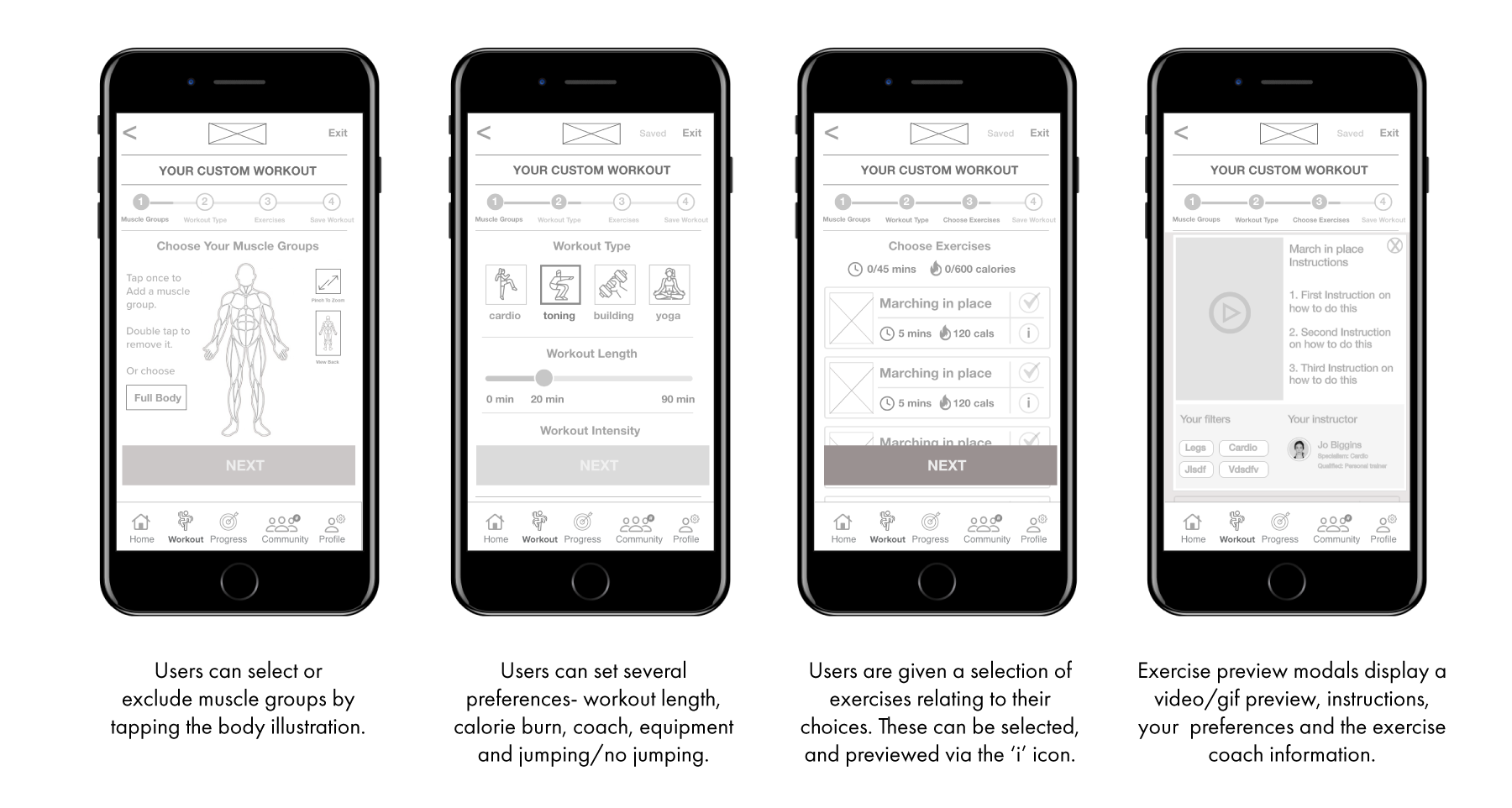
I decided a progressive disclosure flow with a stepper was the most pleasant way for our personas to create their custom workout – with the option to exit and save the process if needed.
I decided a progressive disclosure flow with a stepper was the most pleasant way for our personas to create their custom workout – with the option to exit and save the process if needed.
High-fidelity Wireframes – 'Custom Workout' Flow

Moderated user testing
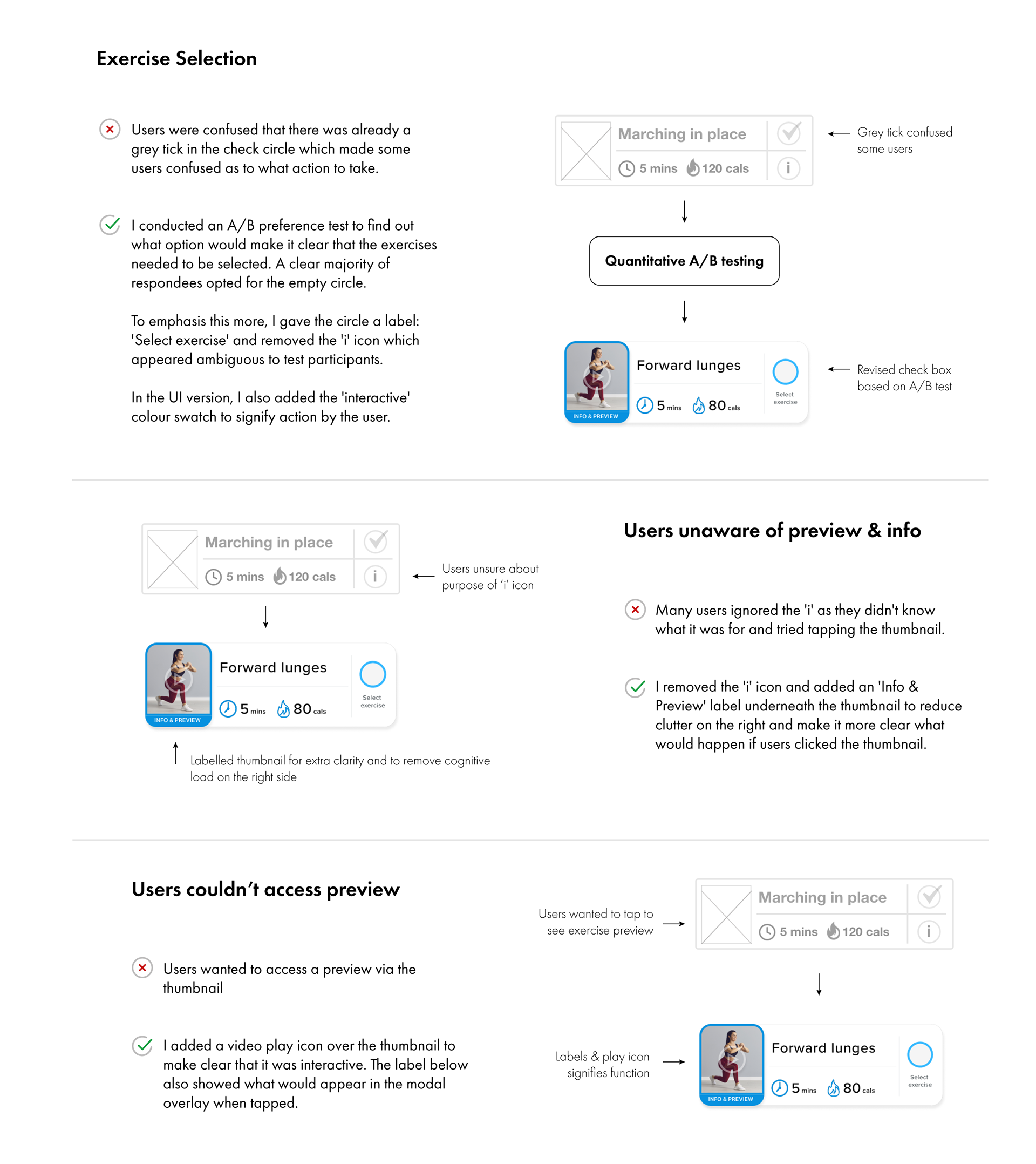
I conducted six moderated remote and face-to-face tests on the high-fidelity prototype. During the tests, I assessed body language and responses and noted any pain points or frustrations the participants expressed.
The results of these were collated and ranked relating to Jakob Nielsen’s Five Components on Usability. The main pain points were addressed before UI visuals and styling were applied.
Learnings from 'Create Custom Workout' flow
Although test participants found the custom workout flow innovative and something they would use in everyday life, the high-fidelity 'Select exercise' wireframe was not reaching its full potential.
Take a look at the issues found in the testing, and the resulting iterations made below.
Take a look at the issues found in the testing, and the resulting iterations made below.
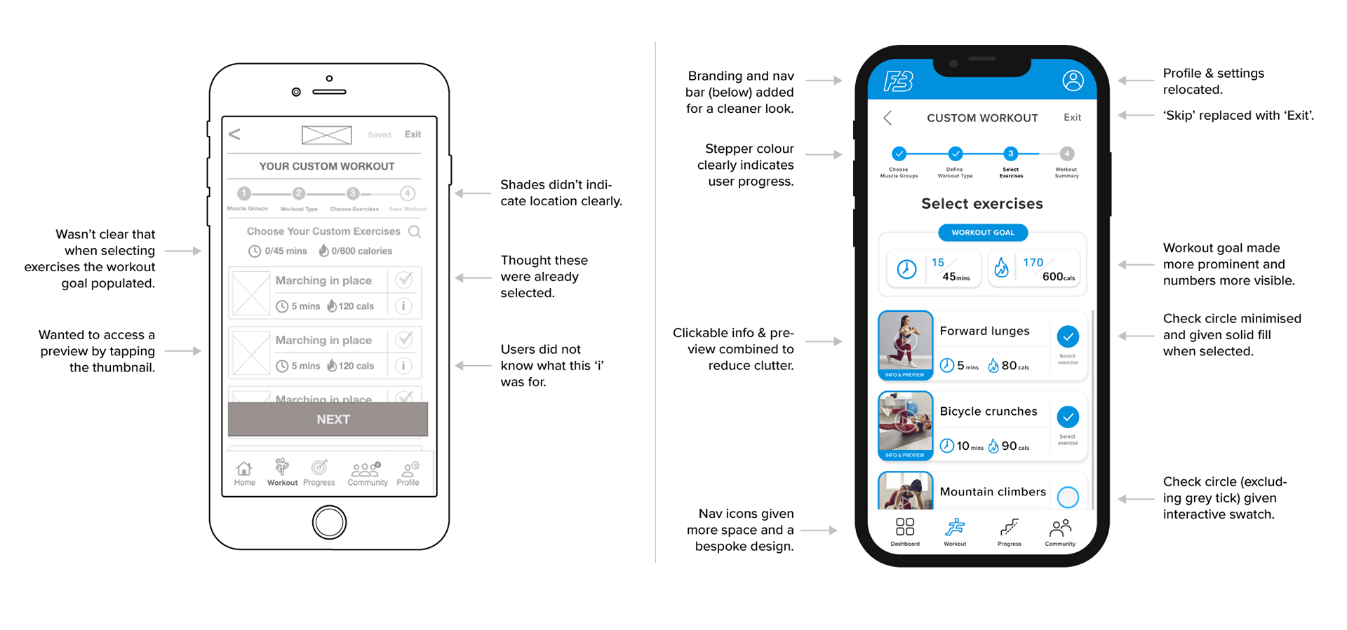
Iteration details – from high-fidelity to UI-styled designs
Fullscreen iterations
Desktop and Responsive Website Considerations
Although my product is designed on a mobile-first basis, as a responsive web app, designing for larger screens and considering breakpoints was essential. Take a look at how two 'Custom Workout' screens translated into a mid-fidelity desktop format at the pre-testing stage.


After iterating based on moderated test feedback and having a successful design, it was time to create the style guide and design system.
Following these design guidelines, I applied the style to each screen in Figma (below).
To view the interactive Figma prototype click below.
Following these design guidelines, I applied the style to each screen in Figma (below).
To view the interactive Figma prototype click below.